When the talented chef and restaurant owner, Jorgina Pereira asked me, “Are you a graphic designer.” I wasn’t sure how to respond. I’ve never earned money for my art or design work. However, I DO have a certain set of skills. Because of how much I love her food, I was eager to say yes. But, I also didn’t want to over promise and let her down. So, I replied with the simple truth, “I’ve trained as a graphic designer but it is not what I do for a living.”
My hesitation evaporated when I learned she wanted me to modify the hard wood “pumpkin patch” sign I’d passed on my way inside. After a brief discussion, I accepted the commission with joy and enthusiasm.
Overview of the Project
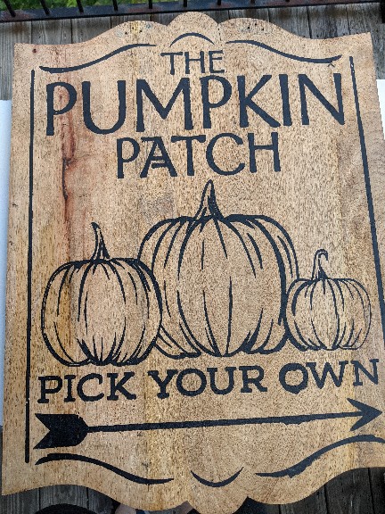
While this commercially screen printed hard wood sign is a high quality holiday decoration – its message won’t resonate with folks looking for Jorgina’s restaurant. 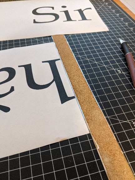
Between the 1960s and early 2000s large format printing was considered an expensive luxury even in professional cricles. I’m glad my parents taught me how to tile print and tape. 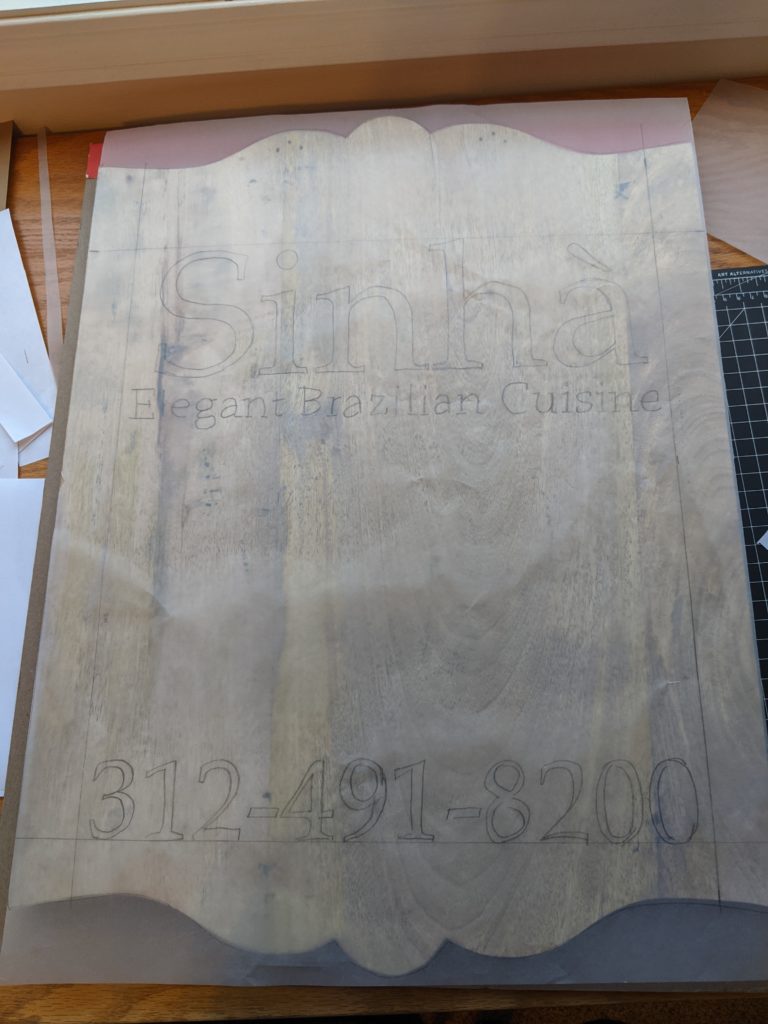
I again used tracing paper to mock up the letter placement at scale. 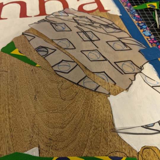
Translating the three dimensional head wrap into two dimensions was one of the most rewarding parts of the project. I’m glad I rush ordered the custom fabric so Jorgina’s idea could be brought to life. 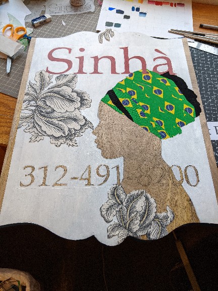
I was afraid to paint flowers so I used fabric remnants from a previous project. Genius! 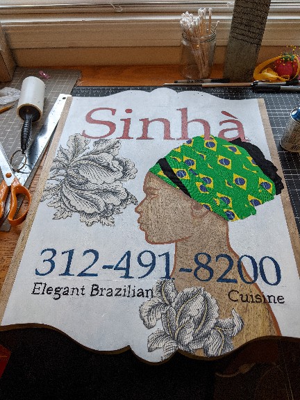
Luckly, I checked with Jorgina before the sign was sealed with a weatherproof UV veneer. I’d accidentally reversed the accent on the last letter. Ooops! 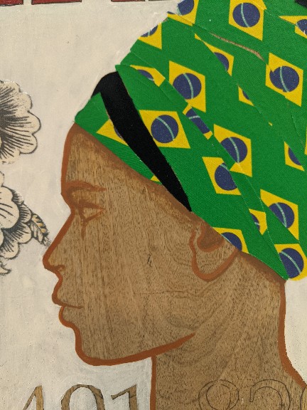
The woman in profile is a nod to the restaurant’s icon who is distinguished, authentic and determined. I redid this part of the sign several times before being satisfied with the result.
Artistic Choices and Constraints
Medium
The sign needed to be ready in 9 days so it could hang at an upcoming event. This time constraint kept me from second guessing and led to my choice of medium. I used acrylic paint because of the vibrancy and quick dry time. I used upholstery fabric for the flowers because I knew I didn’t have the skill to render the concept of “elegance” in the time allowed. It was Jorgina’s idea to make the head wrap fabric a nod to the Brazilian flag and I love how it turned out. The linen-cotton canvas fabric was printed and rush shipped Spoonflower.
Composition
Jorgina and I were united from the start about the project goal: Increase visibility and name recognition. The sign is about the restaurant: its name, its phone number, its tagline. Other visual elements have been used sparingly to keep they eye moving throughout the composition.
I literally painted myself into a corner by not figuring out how the neckline would resolve. A well placed flower saved me from having to cover all the wood texture I hoped to have show through.
The restaurant name means “Lady of the House.” The woman in profile is meant to be a spiritual portrait embodying the complexity and dignity of matriarchs in hospitality cultures. In the head wrap, I hoped mimic the exquisite painted fabric work in Japanese bijin-ga without carrying forward the “male gaze”.
Additional Layers of Meaning
First, the “wood” as skin-tone represents authenticity shining through creative-commercial efforts. It is also a metaphorical critique of race as an intentionally constructed barrier to human solidarity. Lastly, the trees of the Brazilian Amazon are the lungs of the world and so I didn’t want to callously paint over all the wood as if it were not a thing of beauty and necessity in itself.
Lessons Learned
- Alcohol removes acrylic paint! This handy trick saved me from many (but not all) mistakes in craftsmanship.
- I’ve always been too impulsive to pre-mix and swatch paint. I swatched and margin noted my paint mixes this time. Old me was dumb AF to skip this step.
- Varnish is an ink solvent?!? There was some very messy melting of the tagline text at a critical point in the project.
Reflection
In the past, when I’ve taken on projects like this, I felt crushed by high expectations and self-doubt. However, this project felt like a discussion between a visual and culinary artist – grounded in generosity, mutual respect, and joy. The work unfolded naturally. I am deeply grateful to Jorgina for “distracting me” during a difficult time. I needed to heal, recharge and ground myself in the world outside digital mediated reality. I am proud of the art we made together and I hope the sign (like Jorgina’s restaurant) remains a point of community pride for years to come.
